Trendy colours are taking centre stage in the kitchen, bathroom and living room. For 2026, design experts are embracing a rich palette of pastels, cool tones and a few deeper shades to create balance. This year’s colours bring subtle joy, effortless comfort and a renewed appreciation for timeless hues. Let’s explore them together!
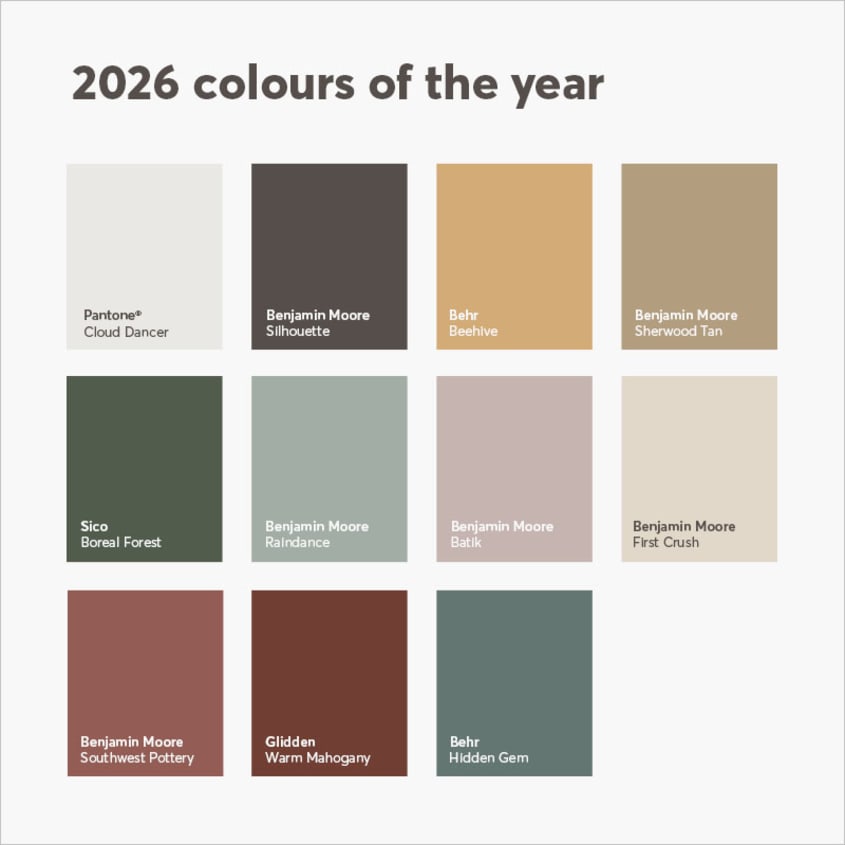
Pantone’s 2026 Colour of the Year: Cloud Dancer
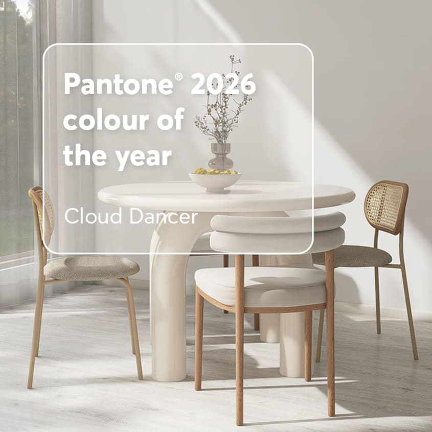
You can’t go wrong with Cloud Dancer, Pantone’s 2026 Colour of the Year. This airy white feels soft and welcoming, like a calm cocoon in a hectic world. Inspired by billowy clouds, it invites us to slow down, let our minds wander and embrace our creativity. Subtle at first glance, it quickly reveals a timeless elegance.
Cloud Dancer is endlessly versatile, working beautifully in any room of the house. In living rooms and bedrooms, it lends a sense of serenity. Use it generously as a neutral foundation, then elevate it with natural textures like light wood, linen, rattan or glass. It also pairs effortlessly with pastels such as pink, peach, powder blue or the popular butter yellow.
Pantone code: Cloud Dancer 11-4201
Benjamin Moore’s 2026 Colour of the Year: Silhouette
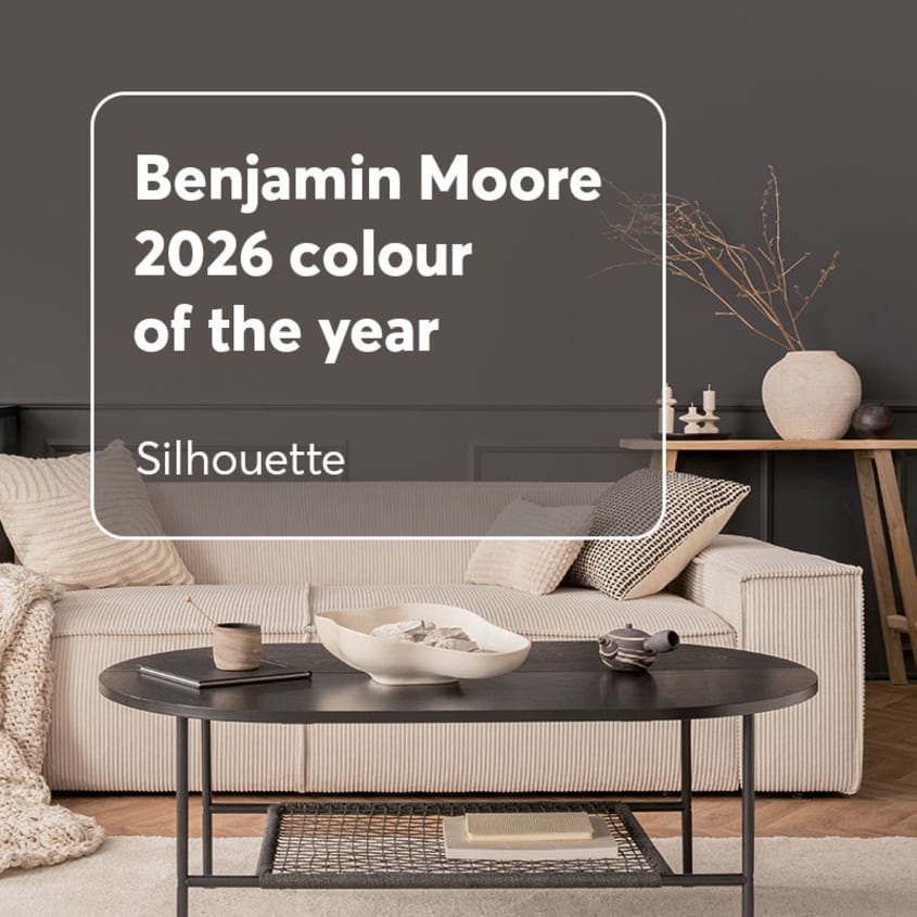
Silhouette, Benjamin Moore’s 2026 Colour of the Year, is a sophisticated mix of plum, espresso and charcoal. Though unconventional, this standout shade slips seamlessly into contemporary interiors. Its distinctively rich hue aligns perfectly with the growing trend toward moody, atmospheric palettes.
Whether used sparingly as an accent or boldly as a focal point, Silhouette adapts beautifully to different design intentions. Pair it with your favourite beige (on moulding or door frames, for example) to create a striking, harmonious contrast.
Benjamin Moore code: Silhouette AF-655
2026 kitchen colours
Beehive
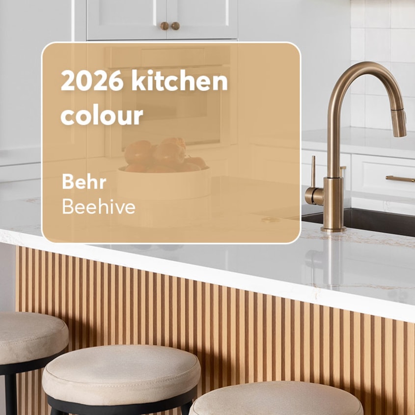
Beehive is one of Behr’s new flagship colours. This warm, subtly earthy yellow evokes the sweetness of honey and the glow of a sunny afternoon. Cheerful yet never overpowering, this golden hue brings a gentle vibrancy to the kitchen. Understated but assured, it’s a shade that instantly elevates the space.
Whether matched with wood or marble, Beehive adds warmth and breathes new life into the room. Use it on the base of an island or as an accent wall, then complement it with warm metals like brass or copper. Finish the look with cream or ivory accessories and you’re golden!
Behr code: Beehive M270-5
Sherwood Tan
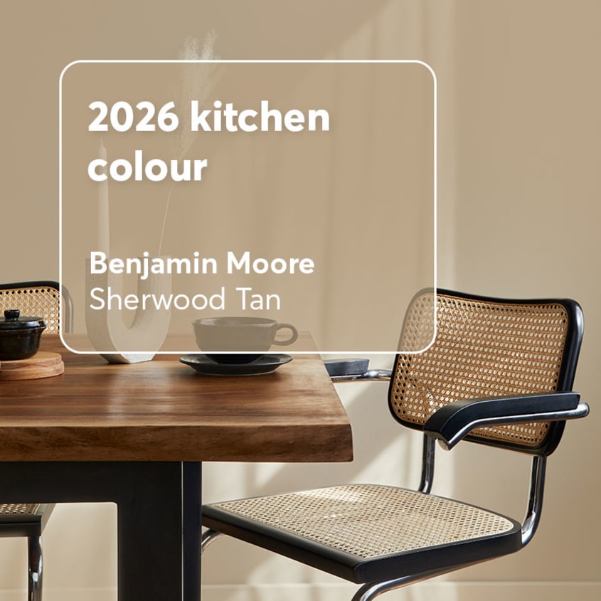
Sherwood Tan, a warm beige with hints of brown, is another standout shade from Benjamin Moore. Leaning into the family of earthy neutrals like brown, it reflects the growing 2026 trend toward organic, nature-inspired palettes.
Pair it with white, soft grey or black to create a balanced, serene vibe in the kitchen. It also goes beautifully with natural materials such as oak, walnut, light stone or marble.
Benjamin Moore code: Sherwood Tan 1054
Boreal Forest
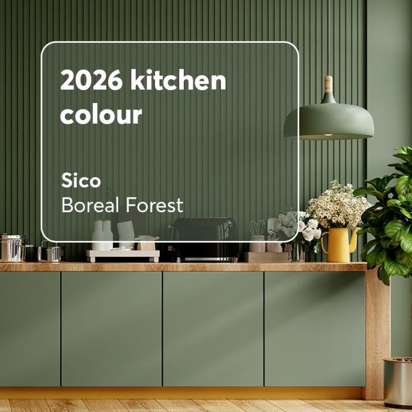
Boreal Forest is a deep, moody green from Sico—one of the many forest-inspired shades making waves this year. Already a favourite in leading kitchen trends, it also transitions beautifully into dining rooms.
To soften its intensity, pair Boreal Forest with a light beige (or a soft white like Cloud Dancer—why not!). You can also introduce subtle notes of lavender or incorporate natural wood accents to bring balance to the palette.
Sico code: Boreal Forest 6167-83
2026 bathroom colours
Raindance
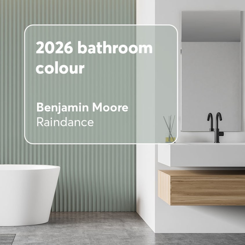
Raindance, a steely green with gentle grey undertones, captures the soothing feel of a quiet rainfall. It’s perfectly suited to a Zen-inspired bathroom designed as a peaceful retreat. Use it on the walls alongside white porcelain tiles or pair it with light grey towels and curtains.
Because it’s a light, breezy shade, Raindance can be used as an accent or as the main colour without becoming tiring. For added warmth, combine it with sandy neutrals or soft cream hues.
Benjamin Moore code: Raindance 1572
Batik
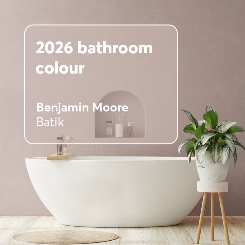
Batik is a soft, dusty shade that falls beautifully between pink and violet—a long-standing Benjamin Moore favourite. Its refined character brings a graceful touch to any interior, especially bathroom spaces.
For added sophistication, pair Batik with gold or champagne fixtures. You can also highlight its gentle softness by combining it with white porcelain or textured glass accessories.
Benjamin Moore code: Batik AF-610
First Crush
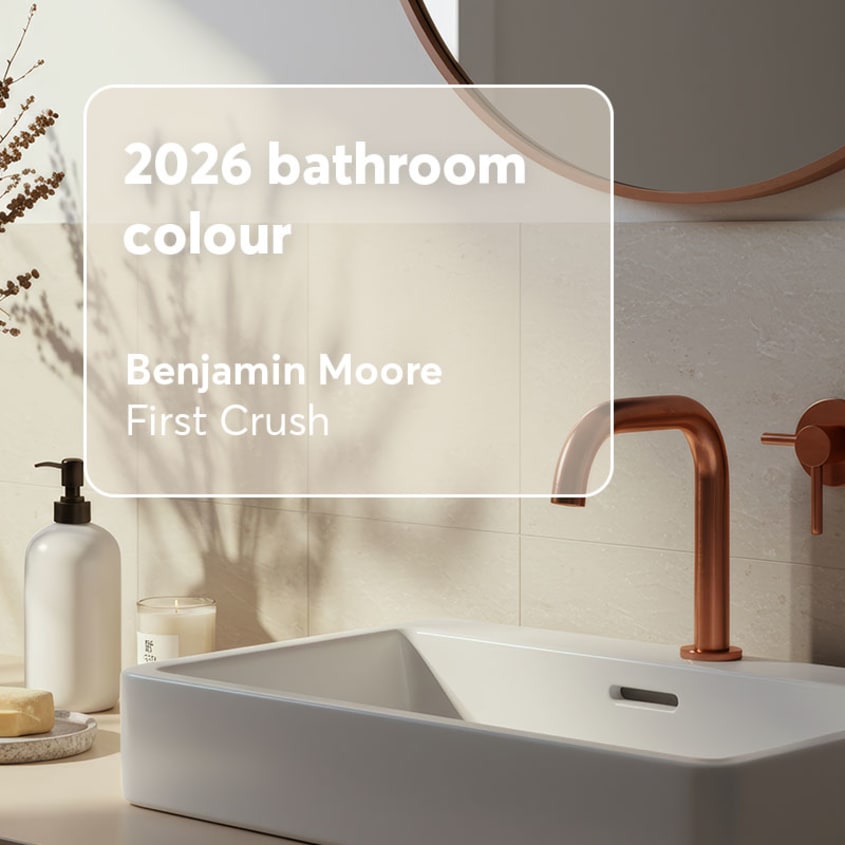
First Crush, a soft shade nestled between beige and pink, has become a favourite in home décor. This versatile neutral is endlessly adaptable! Pair it with pure white for a fresh, luminous look or with sage green for a calming, spa-like atmosphere.
For a bolder contrast, First Crush also pairs beautifully with deeper tones such as charcoal grey. Use the darker shade on furniture or striking details—picture frames, light fixtures, towels or even a ceramic backsplash—to create a refined look that aligns perfectly with today’s bathroom trends.
Benjamin Moore code: First Crush CSP-310
2026 living room colours
Southwest Pottery
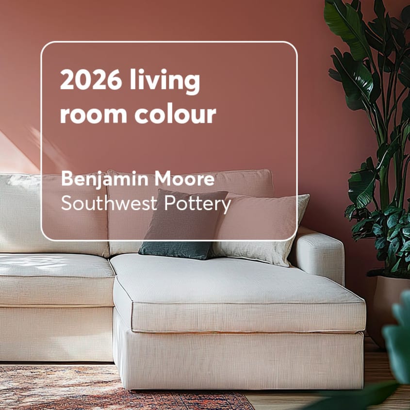
Southwest Pottery, a warm hue inspired by baked clay, feels right at home in the living room. Distinctive without overwhelming the space, it adds character while pairing beautifully with lighter tones.
Use it on walls or furniture, then let a secondary colour shine through your decorative elements—think sandy beige cushions or a creamy white rug.
Benjamin Moore code: Southwest Pottery 048
Warm Mahogany
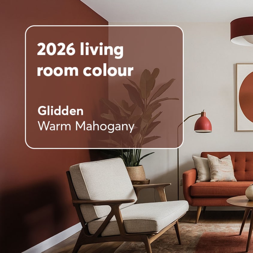
Glidden’s Warm Mahogany is a rich blend of red and brown that captures the inviting depth of dark wood. Distinctive yet comforting, it pairs beautifully with soft beiges, natural wood tones and light greys—shades that echo the organic, nature-inspired palettes that have been gaining momentum since 2025.
With classic, cozy living rooms making a strong comeback, Warm Mahogany feels especially at home. Though it may appear bold at first glance, it’s surprisingly approachable when used with intention. Try applying it around a fireplace or behind a standout piece of furniture, such as a bookcase.
Glidden code: Warm Mahogany PPG1060-7
Hidden Gem
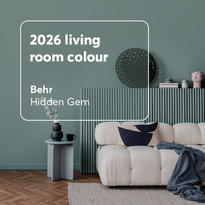
Hidden Gem, a mysterious blend of blue and green, is Behr’s 2026 Colour of the Year. Because of its intensity, it’s most effective when used thoughtfully. Try it on an accent wall in the living room or bedroom to create a captivating focal point. Warm metallics—like brass or champagne—pair beautifully with this shade, adding a refined, elegant touch.
Hidden Gem can certainly be applied to multiple walls, or even the entire room, for a dramatic, immersive effect that’s sure to impress! This bold approach creates a cocooning atmosphere perfect for those who love statement décor. Use it thoughtfully, as too much can feel overwhelming over time.
Behr code: Hidden Gem N430-6A
3 handy tips for combining colours
When working with trendy colours, a few simple principles can help you create a harmonious, visually balanced space.
1. Limit the number of colours
Try to stick to a maximum of three colours per room. This keeps the space from feeling busy and helps maintain a cohesive palette. Not sure how to distribute them?
The 60-30-10 rule makes it easy: use your dominant colour for about 60% of the room (often the walls or flooring), your secondary colour for 30% (furniture and textiles) and limit accent colours to the final 10%.
2. Combine neutrals with contrasting colours
If you’re mixing colours that sit opposite each other on the colour wheel, make sure to include a neutral—such as grey or beige—to soften the contrast.
For example, forest green pairs beautifully with terracotta, but adding a neutral like white or beige helps keep the palette grounded. This also aligns perfectly with the 60-30-10 rule. If you want to explore complementary colour pairings, this video offers a clear visual explanation:
3. Experiment with textures
Finally, incorporating a variety of materials and textures is essential for successful colour combinations, creating spaces that feel layered and visually rich. Try using a dark wall colour and balancing it with soft textiles like linen and cotton, complemented by metal or wood accessories to add depth.
Got a renovation project coming up?
If you’re planning to refresh your décor or transform your home to reflect 2026’s top trends, RenoAssistance is here to help. Whether you’re updating your kitchen, renovating your bathroom or expanding your living room, our team can guide you every step of the way. Contact us today so we can help bring your ideas to life!

