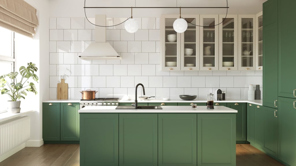
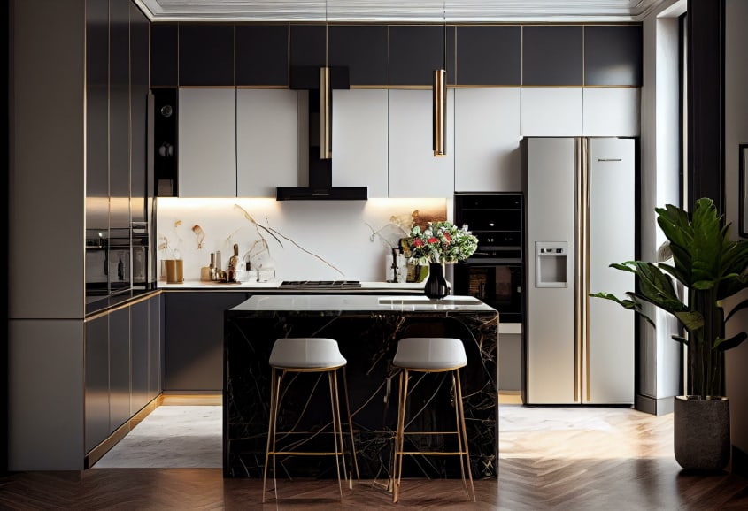
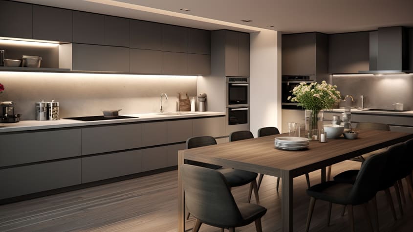
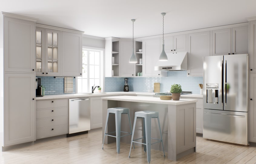
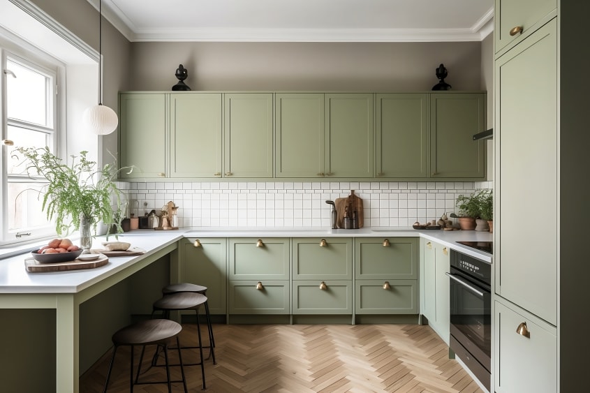
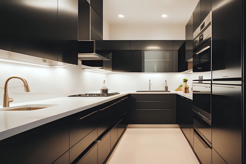
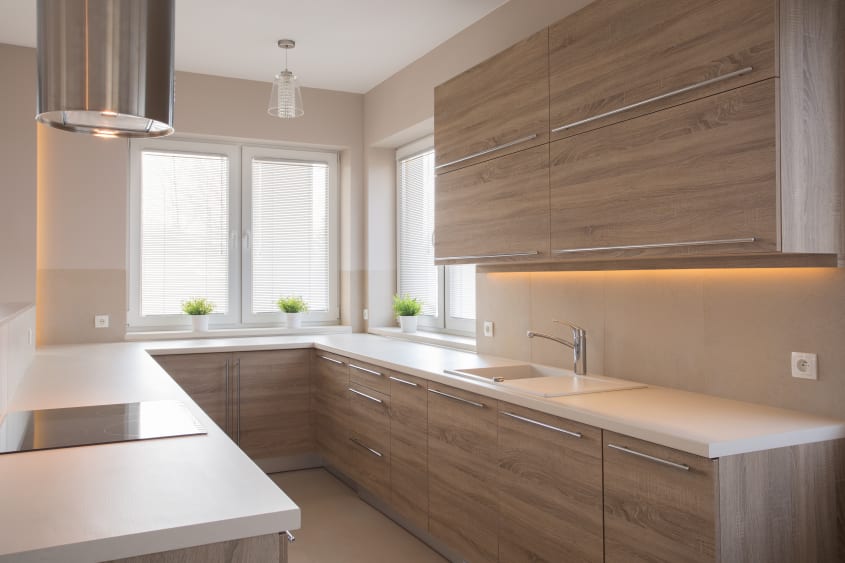
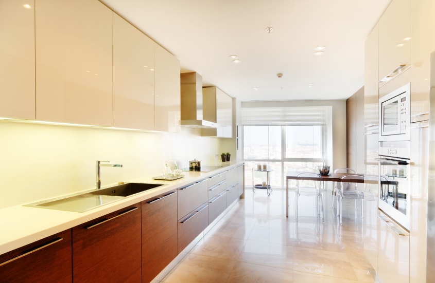
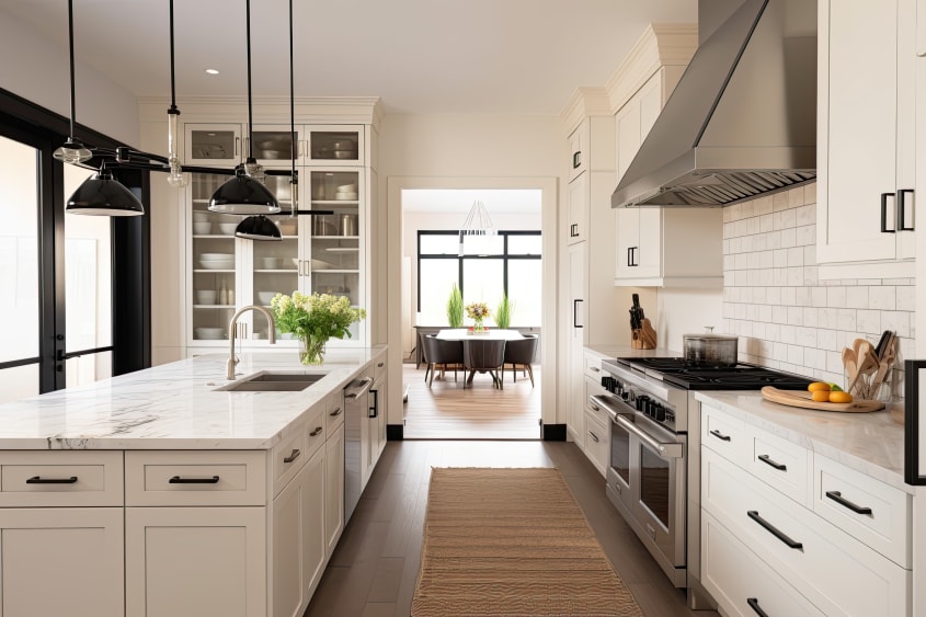
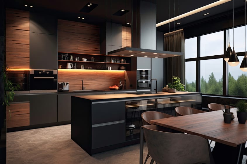
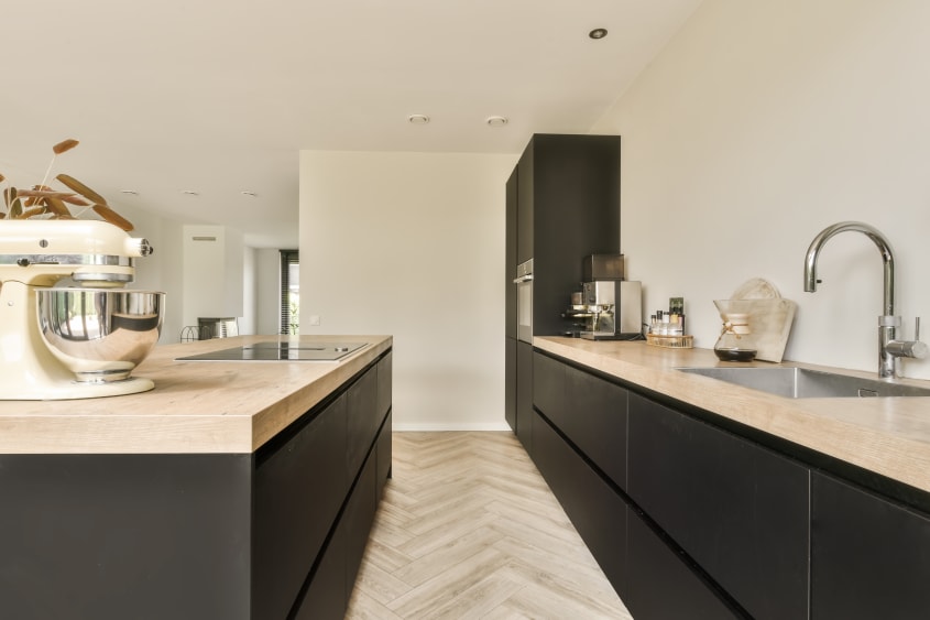
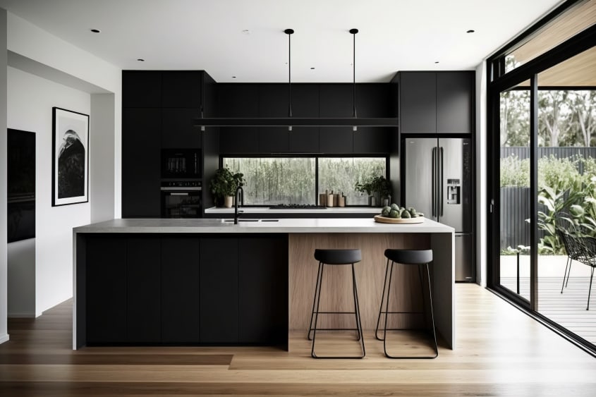
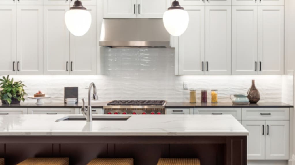
Everyone wants that picture perfect magazine cover kitchen. Some want to use it to create food art while others just need a place for their milk, have one thing in common: they want to be able to access what they need quickly and easily. Everyone knows the trouble with food (aside from the dishes) is having to make it. You want to be able to move around your kitchen efficiently to make your next meal before you run out of energy from the last one. The ideal layout brings together function and form for an efficient design with aesthetic appeal, so you can have a picture perfect kitchen and actually enjoy being in it.
Elements to consider when designing your kitchen layout
Square footage and space limitations
When it comes to kitchens, you should dream big… so long as it fits in the space you have. You shouldn’t be afraid of using all the room you have either; a small kitchen in a big space feels awkward and deprives you of extra workspace or even an eating area. Remember that every activity in the kitchen requires elbow room. Taking your time, doing research and planning, and tailoring your design approach to the footprint you have will prevent cramped or unbalanced layouts.
Adjacent walls and parallel walls
Walls define the footprint of the kitchen. When deciding on a layout for your kitchen, you (or your Kitchen Designer) should look at where the walls are in relation to each other. You should be able to get a sense of which kitchen shape will work best based on the proximity of the walls to each other; close parallel walls would suit a galley kitchen, whereas ones further apart may be better suited to L-shaped or island layouts. You also want to consider what the appliances and cabinetry on one wall will look like compared with the one next to or across from it; cabinets that are similar in size or style across the space can help create a sense of unity that will elevate your kitchen.
Use the kitchen triangle
What is the kitchen triangle? It is a rule that states a kitchen’s main food preparation areas (the stove, the refrigerator and the sink) should form a rule that states a kitchen’s main food preparation areas (the stove, the refrigerator and the sink) should form an imaginary triangle. This concept is all about efficiency; it highlights a set of minimum and maximum measurements between these areas that will allow you to perform your daily tasks with ease. For a kitchen layout to be considered efficient, the combined total distance of the triangle sides must be at least 12 feet and no more than 26 feet; this should leave you enough workspace in between for things like preparation and plating without your sink and main appliances being awkwardly far from each other.

What are the benefits of an efficient kitchen layout?
Have you ever been in a kitchen where you just can’t seem to find your rhythm? The problem is often an awkward layout. Good cooks often perform multiple tasks at a time, requiring them to travel between areas quickly and easily. They also need enough counter space for prep and keeping ingredients and tools handy. A kitchen with a good layout is the difference between feeling cooking is a chore and being excited to work, and even gathering, in the heart of your home.
6 common kitchen layouts
L-shaped layout
L-shaped kitchens are constructed along two adjoining walls. They are common in smaller spaces, such as apartments and condos. This layout style can be difficult to work with when trying to create an efficient space; you can’t leave adequate space between the sink and appliances without making one side of your work triangle longer.
U-shaped layout
U-shaped kitchens hug three adjoining walls in a layout that creates wonderful opportunities for an abundance of storage. This kitchen shape offers flexibility in where your sink and appliances can be placed, meaning you can easily maximize the efficiency of the space. Depending on the existing kitchen footprint, it may be most efficient to use a peninsula to create the U shape.
Galley layout
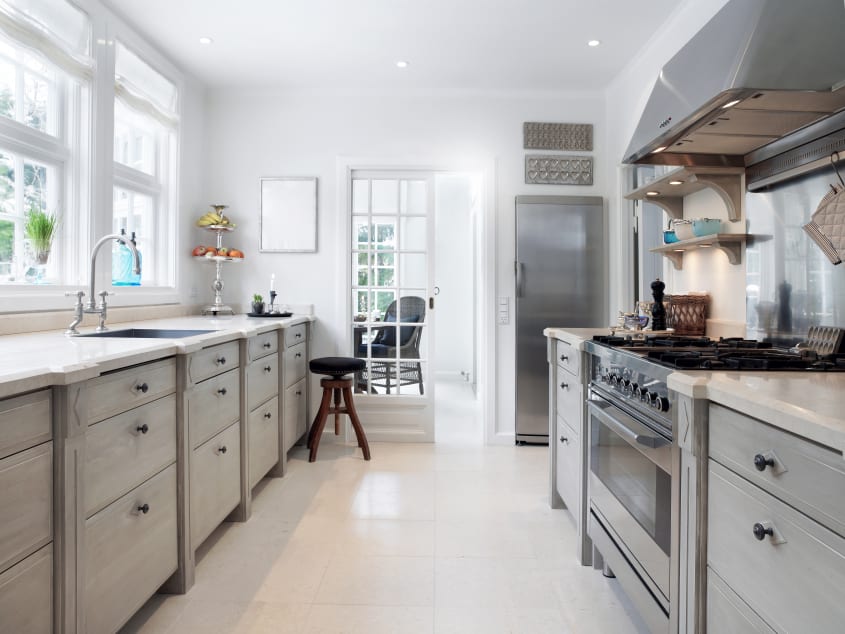
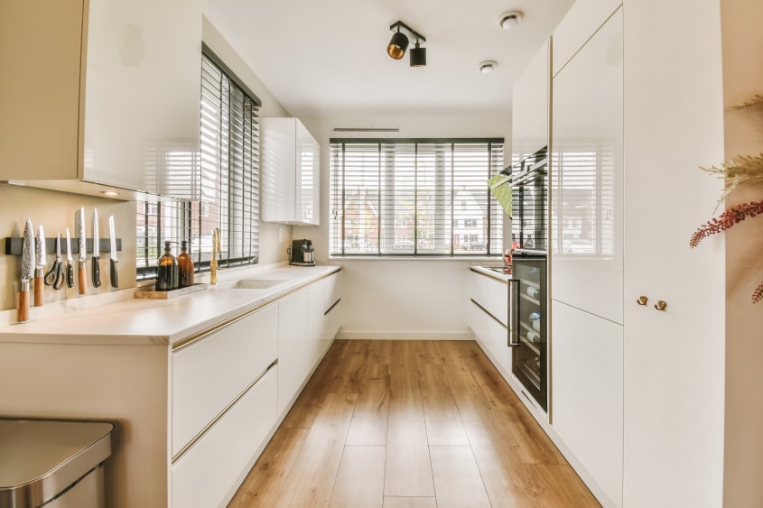
This kitchen layout can be found mainly in smaller homes, such as apartments and townhouses. In some open-plan units, the counters on one side may be built against a half wall with no upper cabinets, leaving the kitchen open and the chef able to interact with people in the next room. While the layout is limited by two of three sides of the kitchen work triangle having to share a wall, galley kitchens can be efficient when well laid-out.
Island kitchen layout
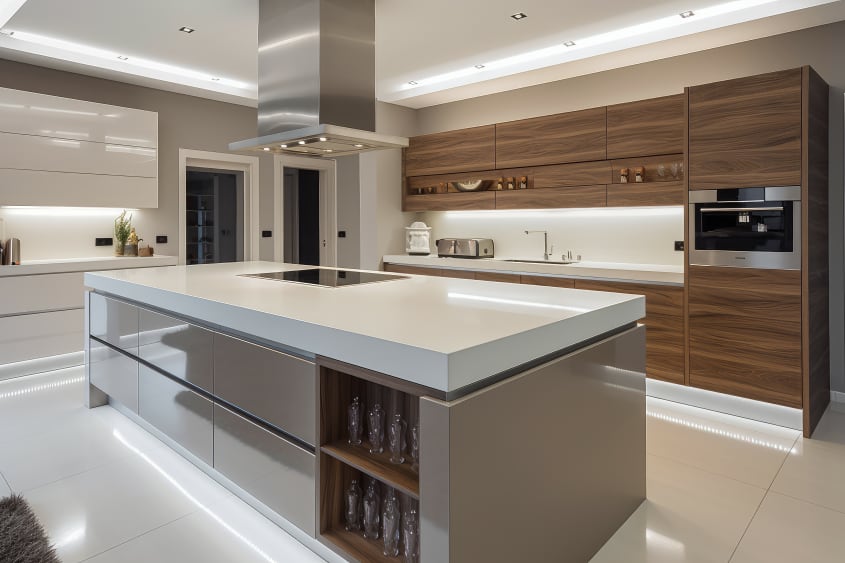
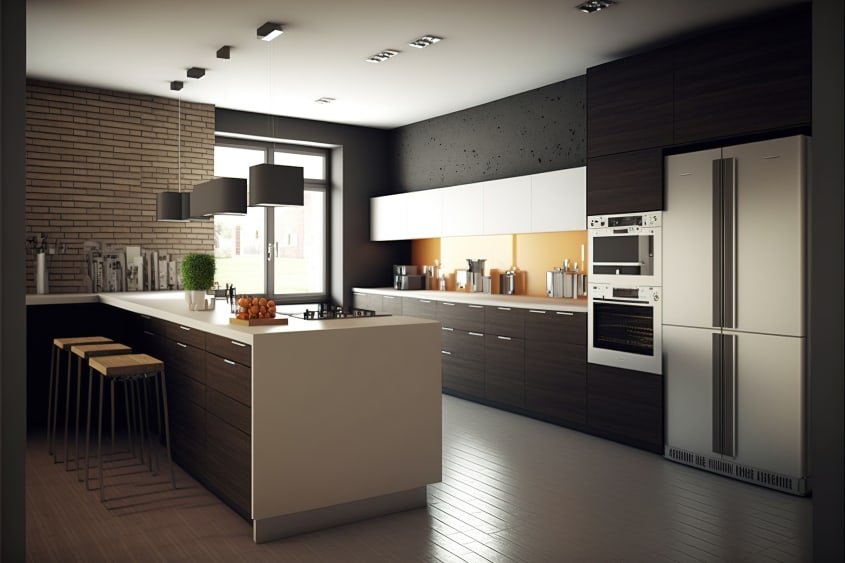
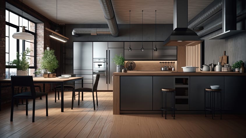
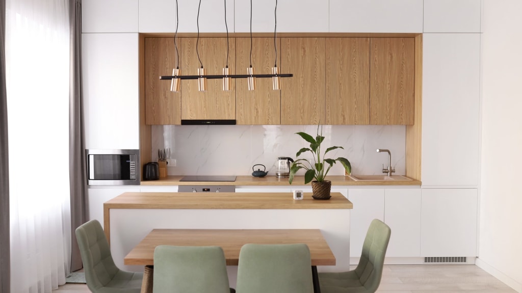
Islands have gained massive popularity in contemporary design to the point of almost being a staple for luxury kitchens. When used properly they can be massively helpful in creating an efficient space. A room that may otherwise have been too large or long can be anchored with an island. Islands with sinks or cooktops can shorten the distances between the zones of your kitchen work triangle, provided the island doesn’t overlap any of the lines too much. The straighter the routes between cooking and cleaning zones, the more time and energy you’ll be saving yourself every time you use your kitchen.
One-wall kitchen layout
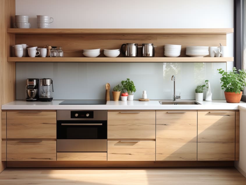
One-wall layouts are the least efficient way to design a kitchen. The problem is with the kitchen work triangle: in this layout the triangle becomes a straight line. There is virtually no counter space since there is only so much room you can leave between the three main kitchen zones. While necessary in some spaces, such as bachelor apartments, it’s best to avoid one-wall kitchens when possible. The extensive side-to-side crab shuffle required when using this kitchen type quickly becomes monotonous.
Peninsula kitchen layout
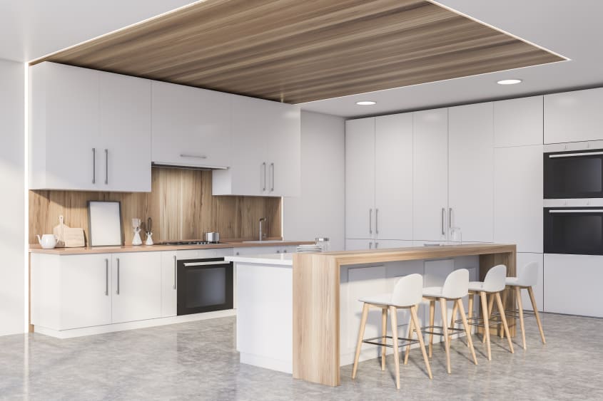
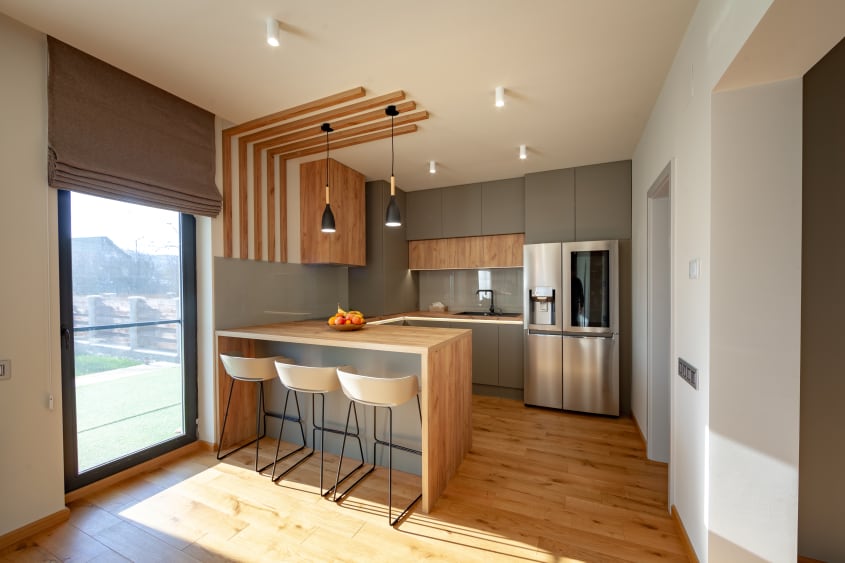
Kitchen peninsulas (kitchen islands adjoining the wall counters) are used to create U- and G-shaped kitchens from L- and U-shaped ones respectively. They can be used for additional workspace within the kitchen or as dining spaces that allow you to cook and entertain at the same time. This is a great layout for breaking up large or open spaces while creating additional counter space and room for storage.
Kitchen layout ideas by size
10 x 10 kitchen layout
When designing a 10-foot by 10-foot kitchen, it is important to spread out the appliances to create a good balance and flow. This is because the distance between parallel walls is 10 feet, meaning zones of the work triangle placed directly across the room from each other will have less than 9 feet between them, the maximum distance allowable by the kitchen triangle rule for efficient workflow. A U-shaped kitchen with the fridge at one edge of the U and the sink and range split between the remaining two walls.
15 x 15 kitchen layout
A 15-foot by 15-foot footprint allows for more flexibility but requires strategy to execute well. With many appliances being manufactured at counter depth (about 2 feet from front to back), that leaves a minimum of 11-foot distance between activity zones placed on parallel walls. Moving areas of the work triangle closer to each other means either limiting them to two perpendicular walls or using an island or peninsula to make space for a range or sink closer to the existing walls.
Optimize your storage space
Corner spaces and upper cabinets
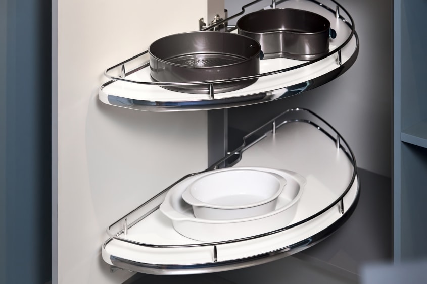
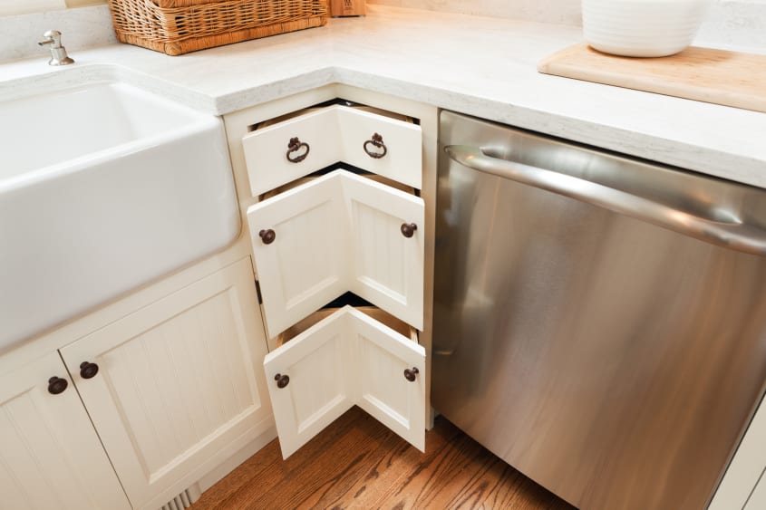
Kitchen corners are sometimes tricky. It can be hard to plan upper cabinets that use corners efficiently while being able to access all the items within. One of the main things to keep in mind when planning for a corner cupboard is door size; make it too big and it’s awkward (not to mention a safety hazard when open) but make it too small and you can’t retrieve the items inside. Don’t be afraid to put a Lazy Susan in both upper and lower corner cabinets; it is a great way to make use of corner spaces without wasting time digging for things near the back of the cupboard. If you want something less traditional, there are plenty of corner storage options that fit both your functional and aesthetic needs. For hard-to-reach upper cabinets, consider keeping tall, lightweight items, such as cookie sheets, stacked vertically, eliminating the need to reach as high or deep into the space to retrieve what you need.
Counter space and base cabinets
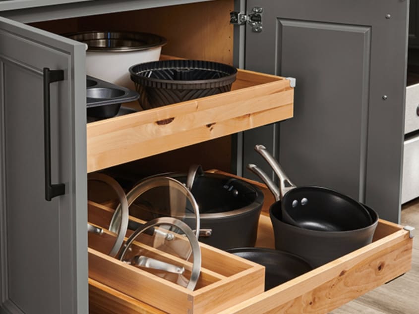
Counter space is worth its weight in gold and some people are willing to pay top dollar to have an abundance of it in their kitchens. With more counter space, of course, comes more room for base cabinetry. Using this space wisely can be tricky. With an increase in generational homes and individuals aging in place, there is growing concern from homebuyers and those looking to renovate about bending down to search through cupboards; designing your cabinets with slide-outs, or replacing them with drawers, reduces the amount of bending and leaning required to see the contents. In today’s market, safety sells.
Storage space and extra storage
With the advancements of modern technology, like new methods of idea sharing and manufacturing, there has been an influx of handy kitchen appliances and gadgets. They save us time and energy in every area but one: storage. Where to put all the new things as they keep coming? That hand blender seemed like a great gift until you realized you have nowhere for it to fit comfortably. Storage space that has been well-planned should have room for what you have now, as well as leaving additional space for things you may yet bring into your home.
Kitchen layout tools
Being the heart of the home, it’s unsurprising kitchens have their own dedicated tools for design and layout planning. Many items for kitchen come in standard sizes, making designing them much like playing with building blocks; without practice, it can be difficult to understand where each block fits. Fortunately, with the help of online tools, like the kitchen planner by IKEA, you can easily visualize real cabinetry and appliances in a room you can customize to match the real dimensions of your home. This allows you to get a sense of such things as how much room or storage you might have with different layouts.
FAQs about kitchen layouts
How do I layout a small kitchen?
With a small footprint, it is key to maximize useable space; this means keeping small appliances and other items off the counters. Over-the-range microwaves, oven-air fryers, and other combination appliances can help save counter space. Another popular option is an appliance garage, a nifty hideaway for small appliances. Be sure to check your local codes for any special building requirements before choosing this feature for your home.
How do I fix an awkward kitchen layout?
If you have an awkward kitchen the problem probably lies in your kitchen work triangle. Make sure the total distance between the sink, stove, and fridge is between 12 feet and 26 feet. The next most likely suspect would be storage. A kitchen having a lot of storage doesn’t necessarily equate to things being put away in a tidy fashion; cupboards and drawers that aren’t chosen with functionality in mind can lead to hours of frustration for homeowners struggling to find this or reach that.
Why is the layout of a kitchen so important?
If you’ve not left the right amount of room between zones your kitchen can work against you, leaving you struggling to reach things just out of reach or knocking stuff off easily crowded counters. Even the best of cooks and bakers can only do so much with a poorly planned workspace.
Getting the perfect kitchen like you’ve seen online means looking at more than just aesthetics. A kitchen that pretty but not practical or well laid-out is like a beautiful instrument mournfully collecting dust when it should be played and enjoyed. By creating a layout that works with your space, your kitchen can be gorgeous and you’ll look regal gliding confidently between stations while expressing your culinary genius.
